Talea Beer Co.
—Sticking It To The Bro's

About the project
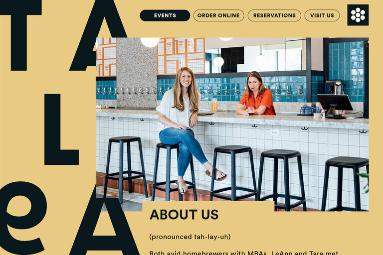
TALEA BEER Co was launched by former home brewers Tara Hankinson and LeAnn Darland, who sought to fill a void in the ‘beer bro’ heavy craft beer market, identifying a lack of approachable brands that felt inclusive for women. The idea wasn’t to create an overtly feminine brand just something that would sit outside the glut of overtly masculine brands and offer something different.
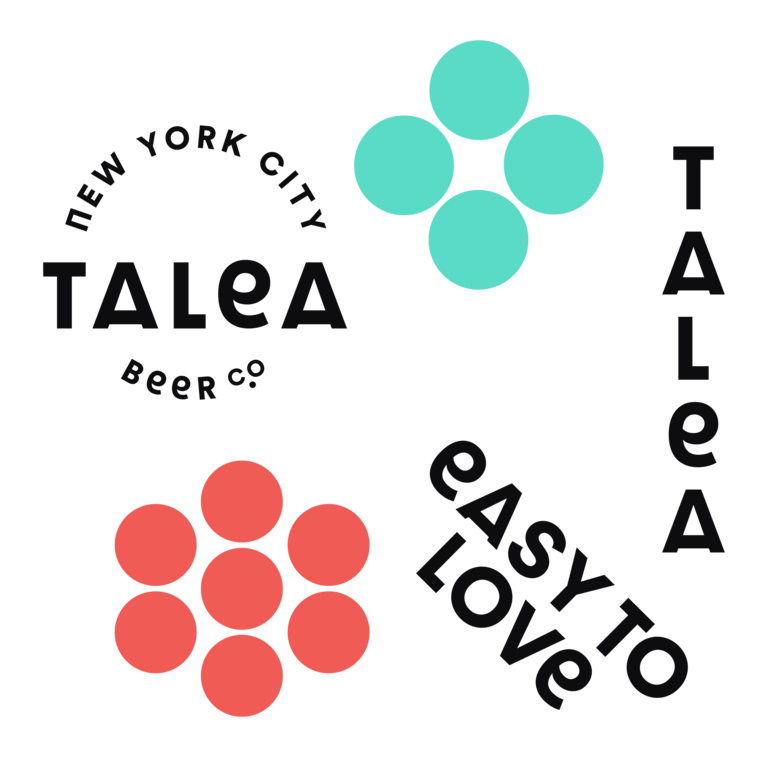
We worked with Tara and LeAnn from the outset, helping land on a name and building the brand identity from the ground up, the aim was to create a unique feel within the market that would speak to female customers without alienating other beer drinkers. They wanted something bright, bold, graphic, welcoming and aspirational and something that could grow with them.
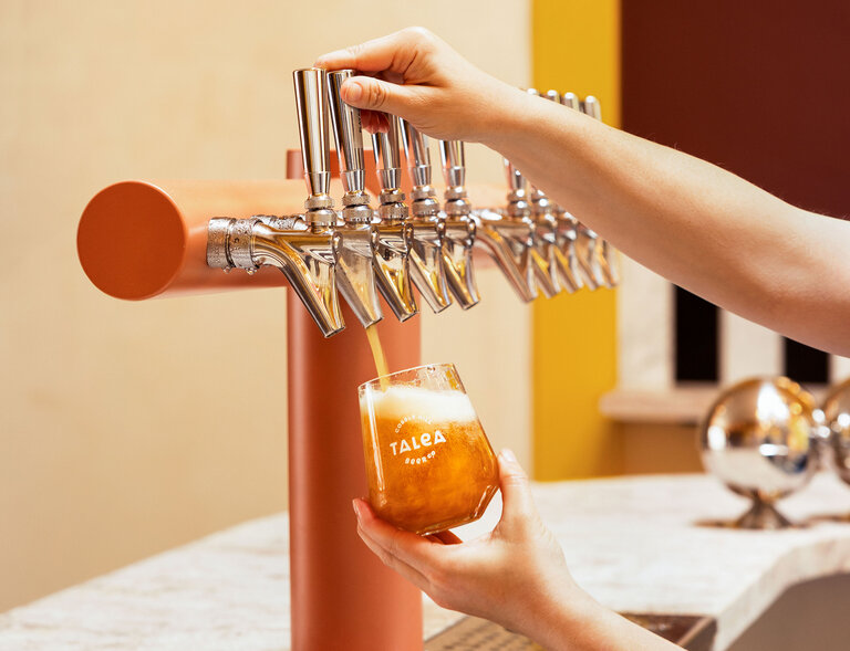
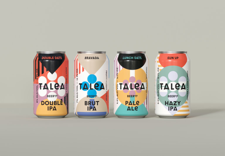
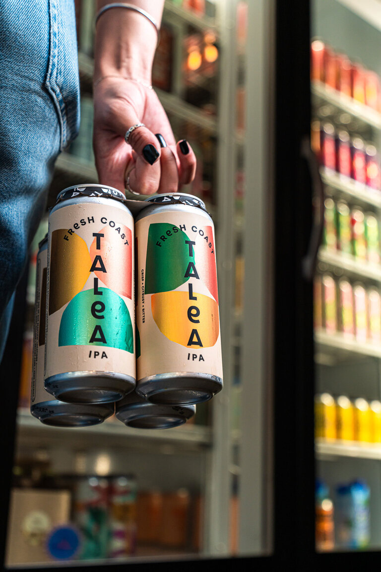
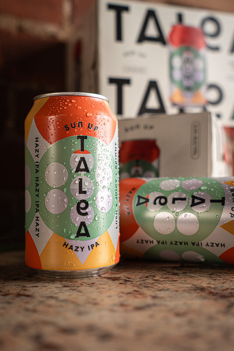
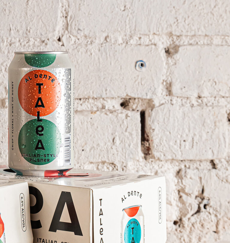
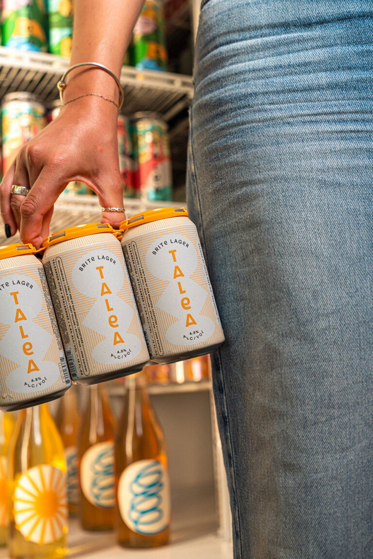
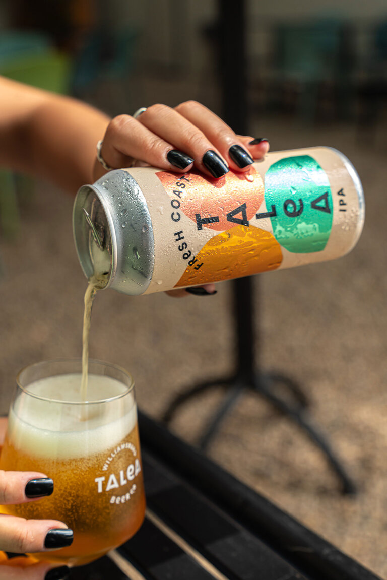
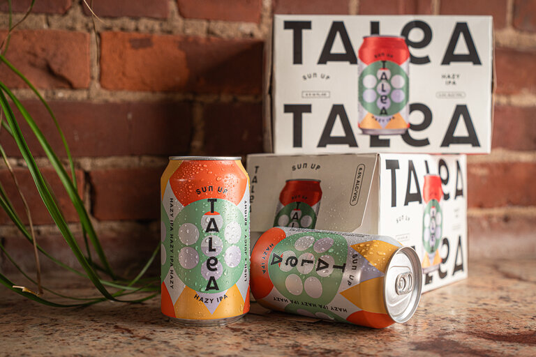
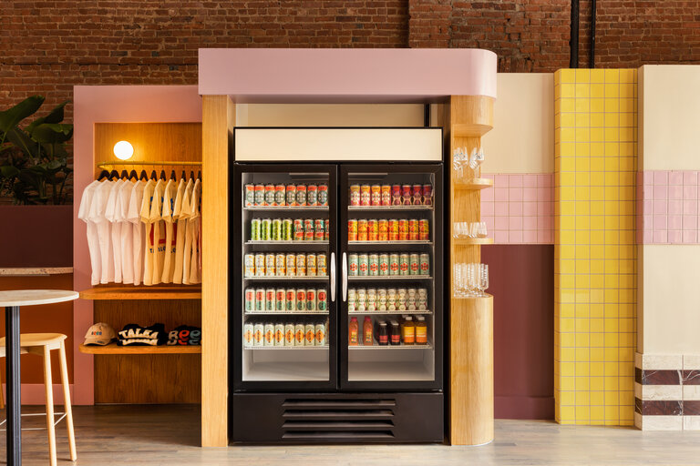
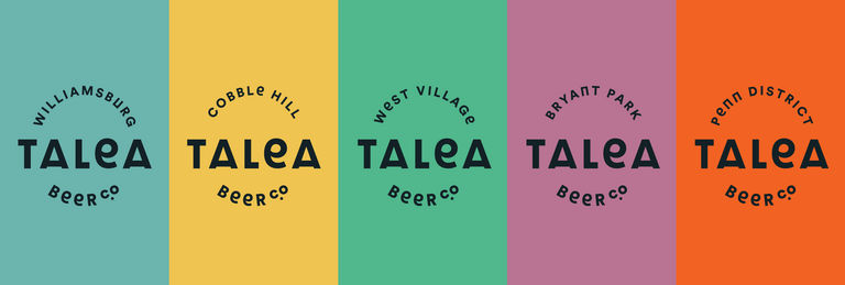
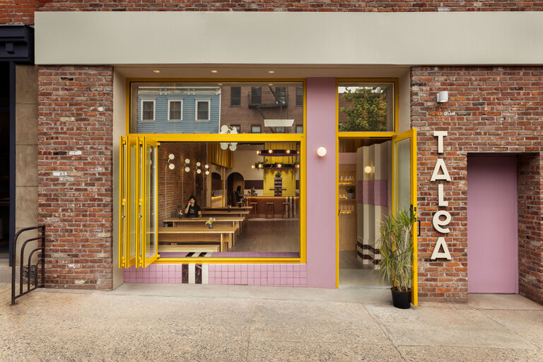
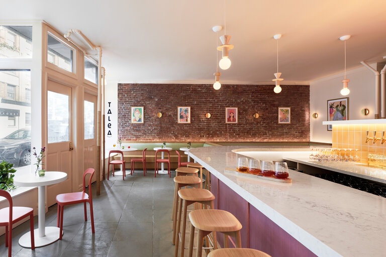
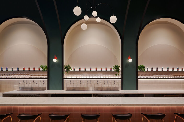
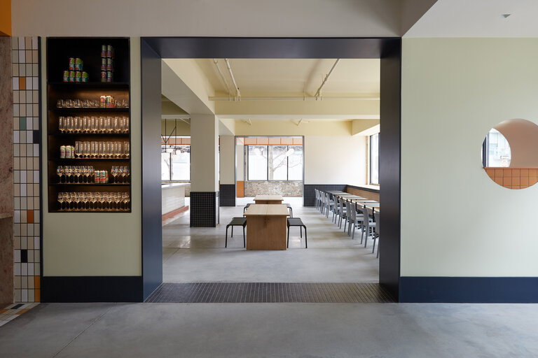
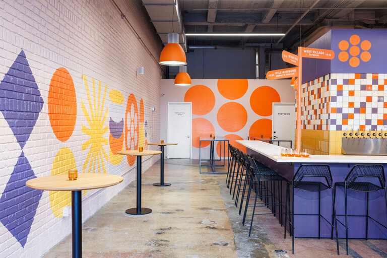
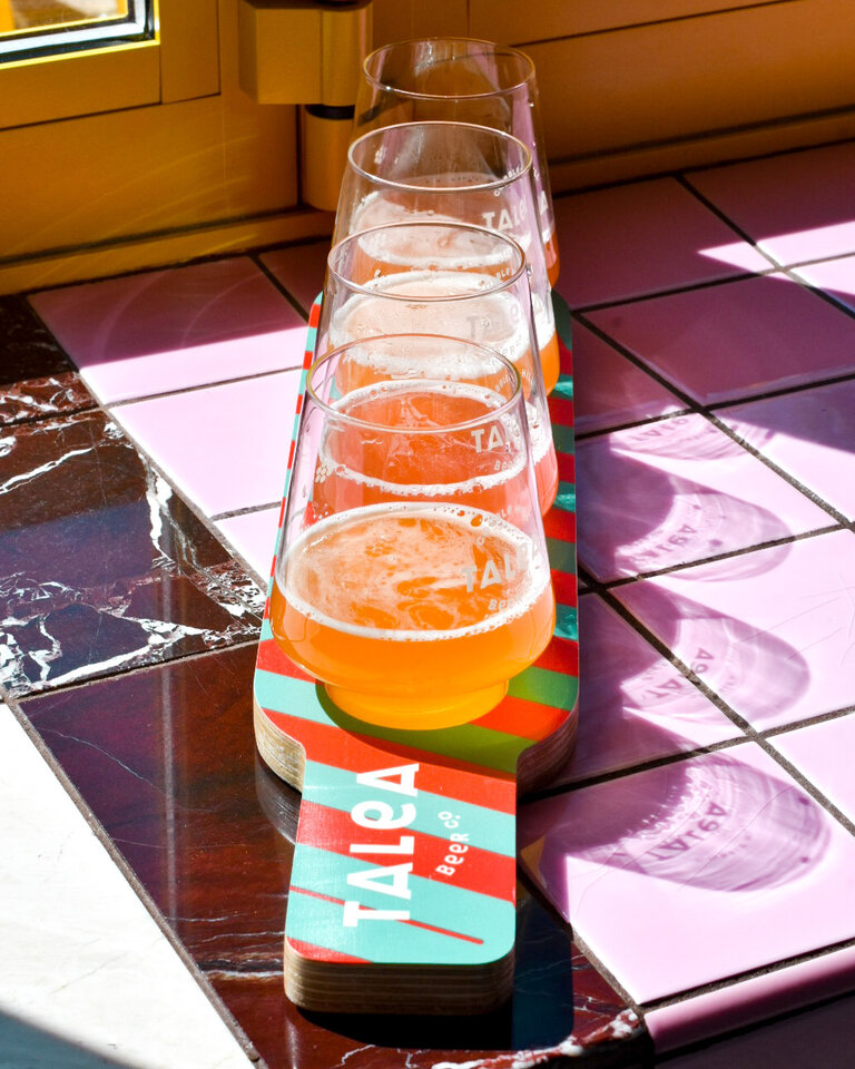
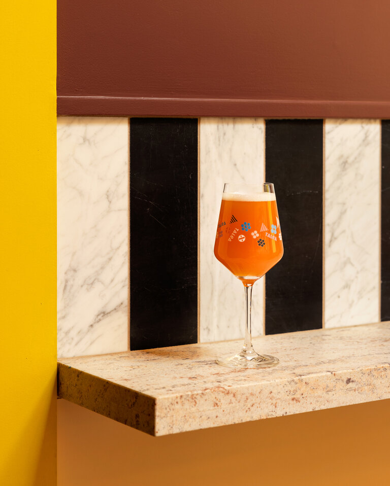
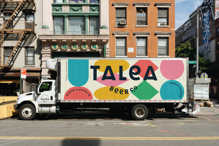
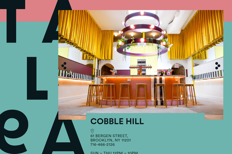
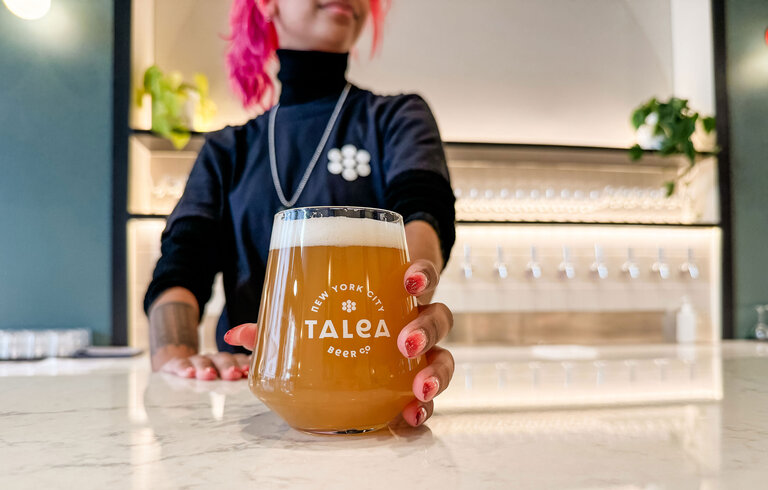
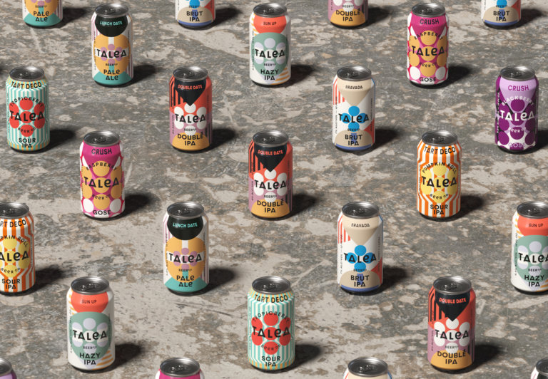
We created the initial identity and packaging for the first four beers using big graphic shapes inspired by vintage optometrists light boxes with a nod to the term ‘blind drunk’. The modular shapes and bold colour palette adorned the initial packaging and marketing and helped the brand enter the market with a bang. The brand was an instant hit and Talea, over the past six years, has seen rapid expansion including five New York taprooms, with sixth on the horizon, additional lines with wine and seltzers and many exciting collaborations.
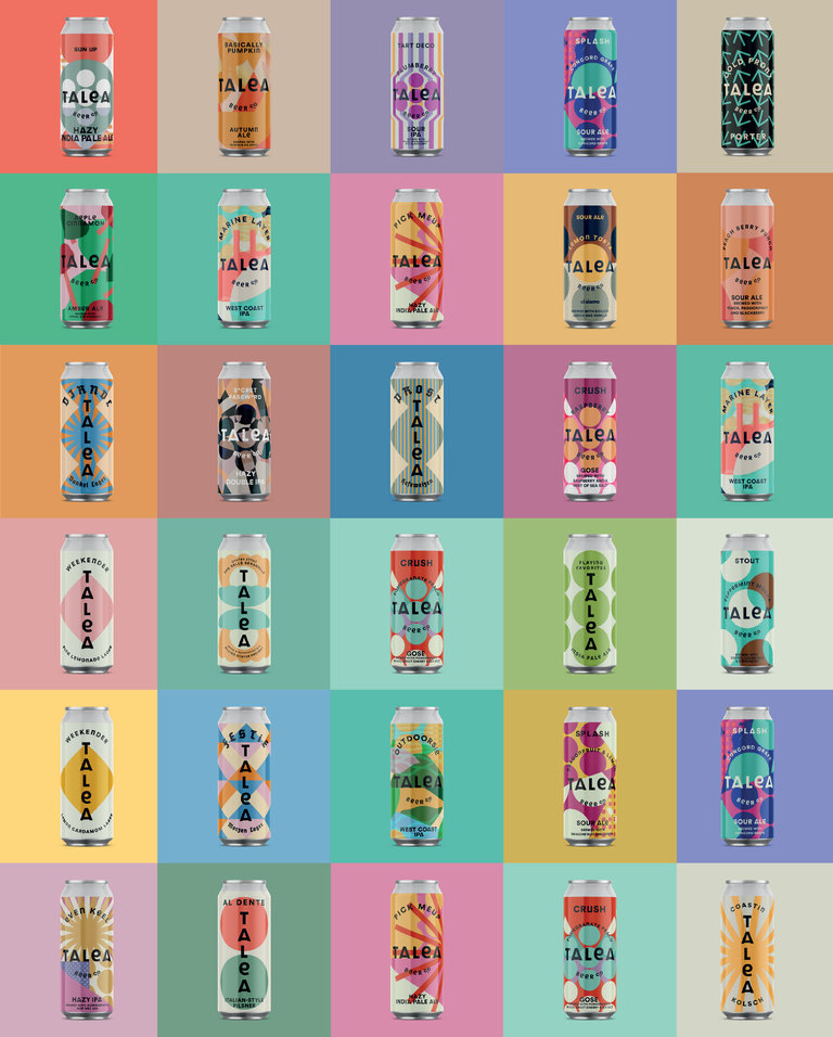
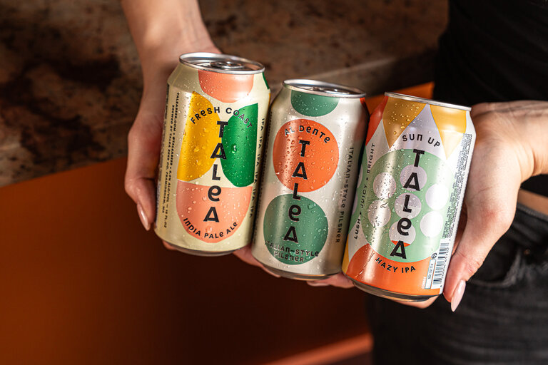
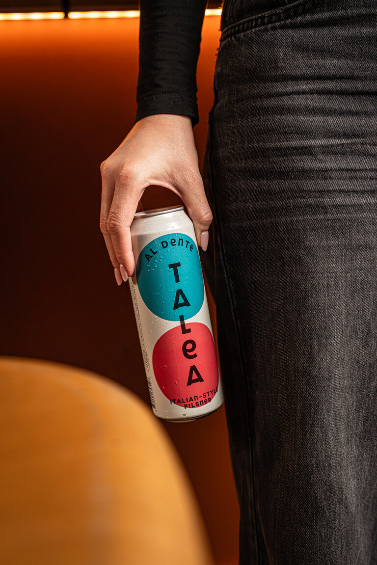
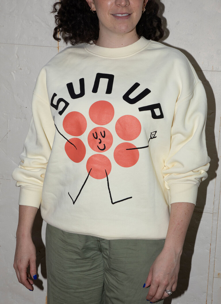
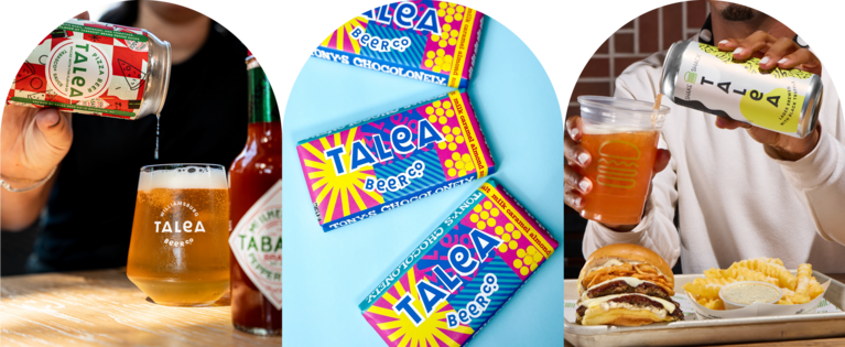
We have designed over 200 beers with Talea as well as many exciting collabs with brands such as The New York Public Library, Tony’s Chocolonely, Shake Shack and Tabasco to name a few. Recently we redesigned the core range of beers that will help roll the brand out nationally.
Sectors
- Food & Beverage
- Restaurant & Bar
Services
- Branding
- Graphic Design
- Art direction
- Naming
- Packaging
- Illustration
- Digital
What they say
John has been instrumental in building our brand identity and ensuring consistency of message and aesthetic. We started working with John before we had finalized our brand name and first products. Now, seven years later, hundreds of SKUs, and with an ever-growing scope, he continues to delight us. John helped us articulate our brand and create a visual identity and language that continues to succeed on the shelves of Whole Foods and Trader Joe's, as well as in our five brick and mortar locations. I love that he is always game for new product extensions or designing small but meaningful details. When doing collaborations with brands like Tabasco and Olipop, our partners are always impressed by his work. I firmly believe we would not have had as much success without John as a partner. Any brand who he brings on is incredibly lucky to have him in their corner.