I
W
A
N
T
Branding, interpretation design, exhibition design, print collateral
Packwood House
National Trust
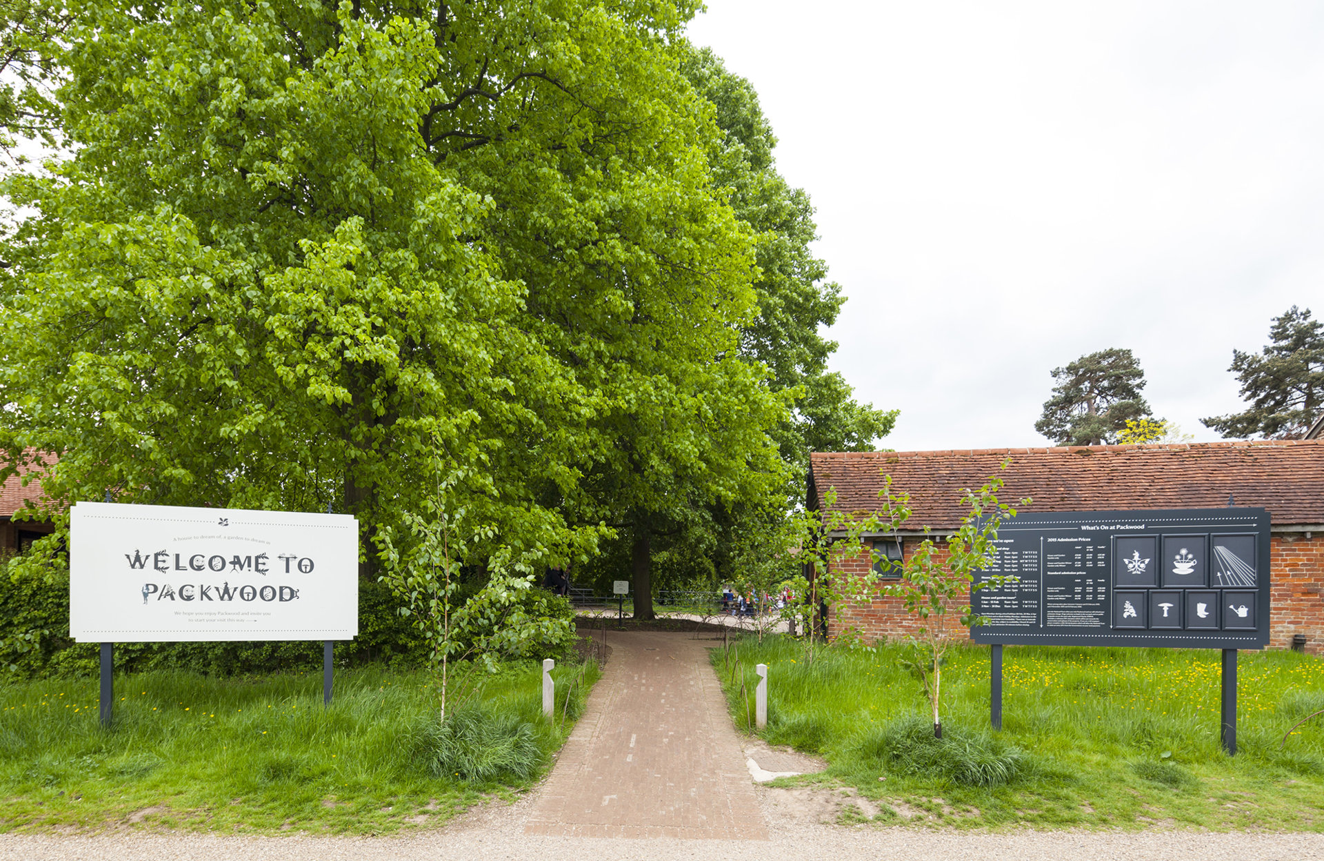
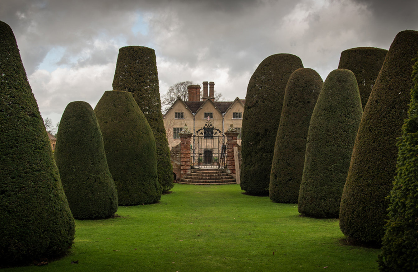
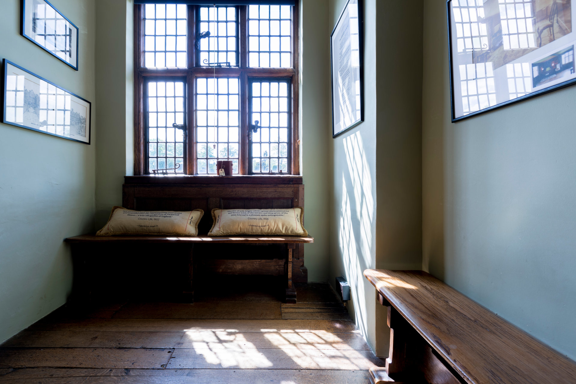
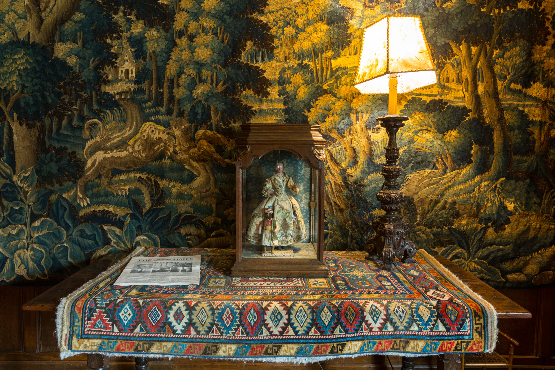
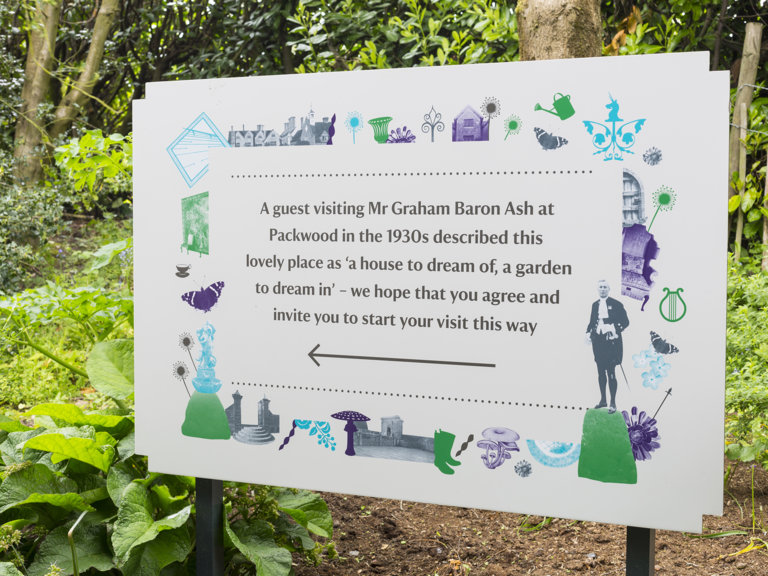
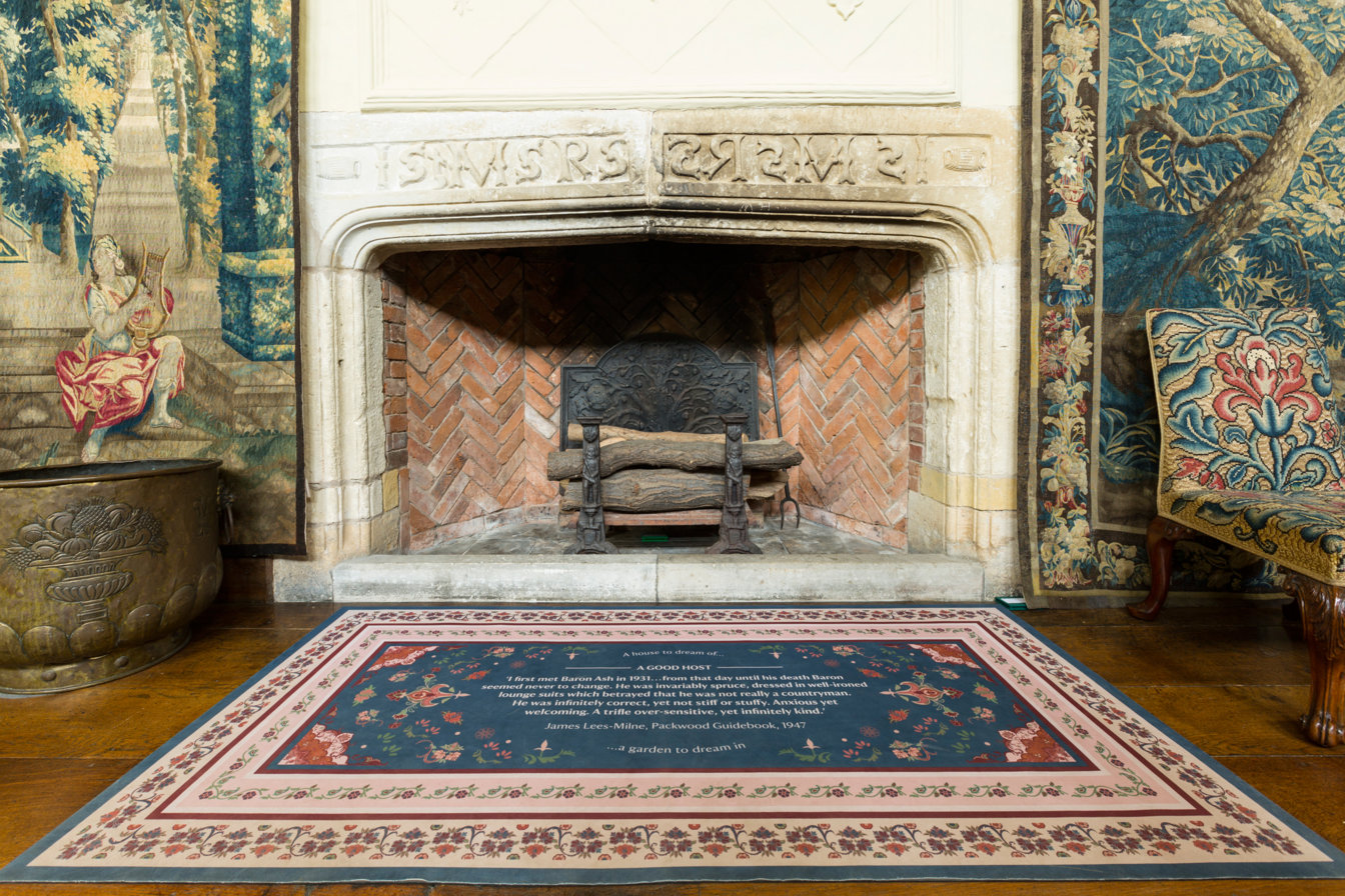
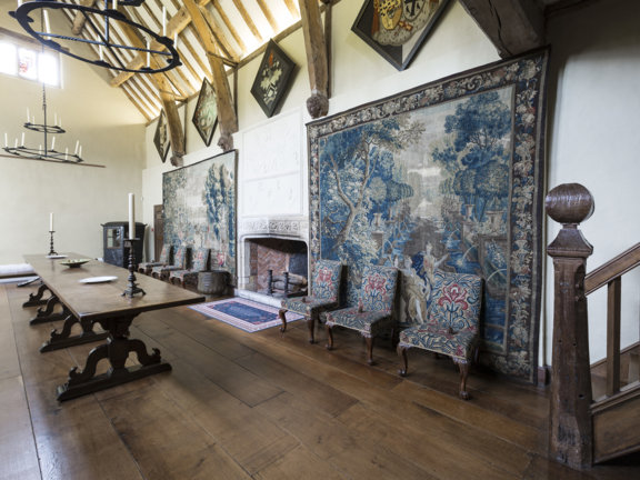
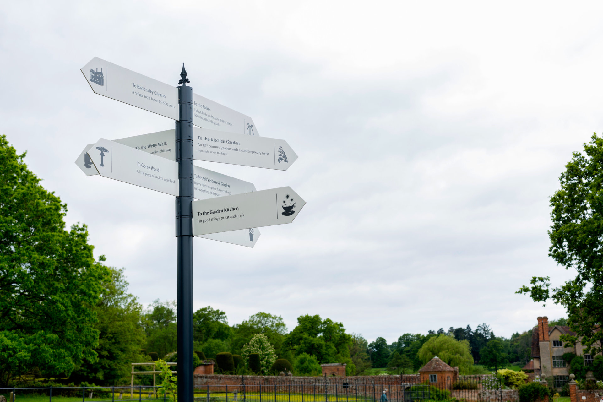
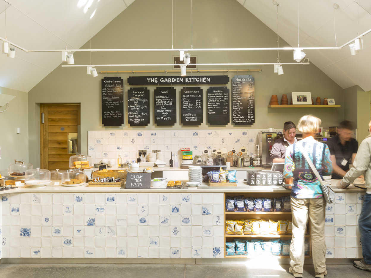
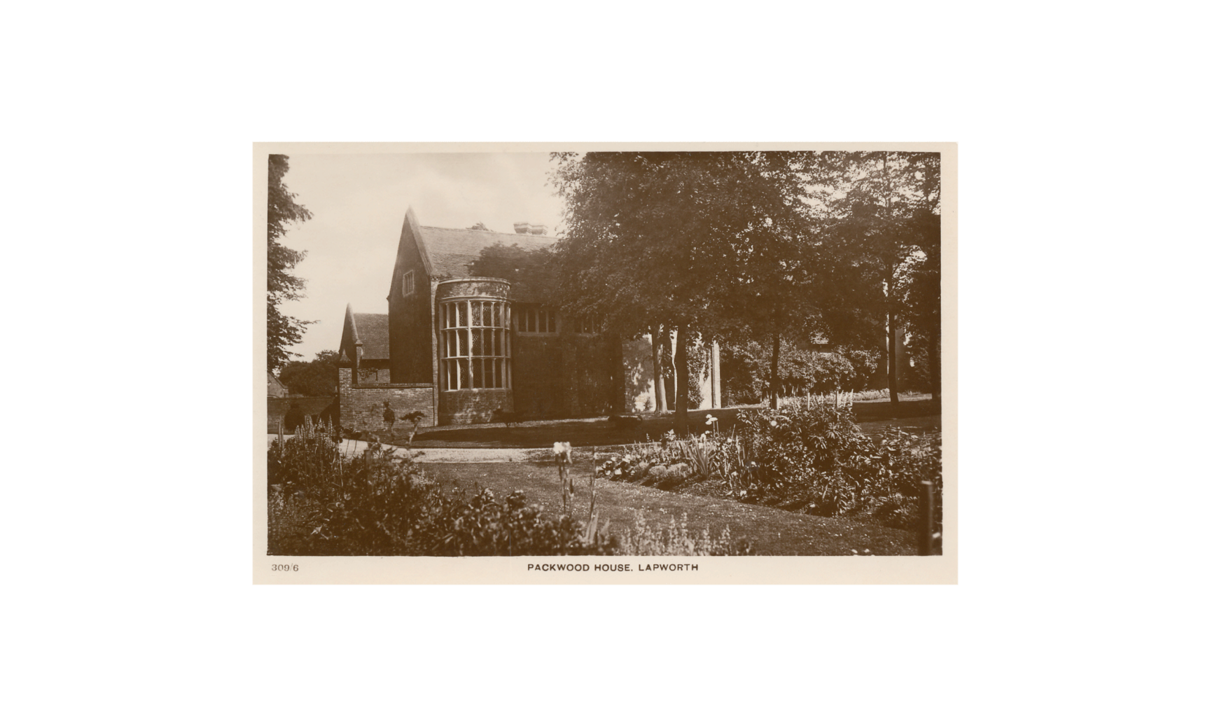
The National Trust approached us back in 2013 to re-design the visual language of Packwood House to reflect the properties individual 'spirit of place'. The project was an experiment, the first Trust property to have its own identity operating within the framework of the over arching National Trust brand.
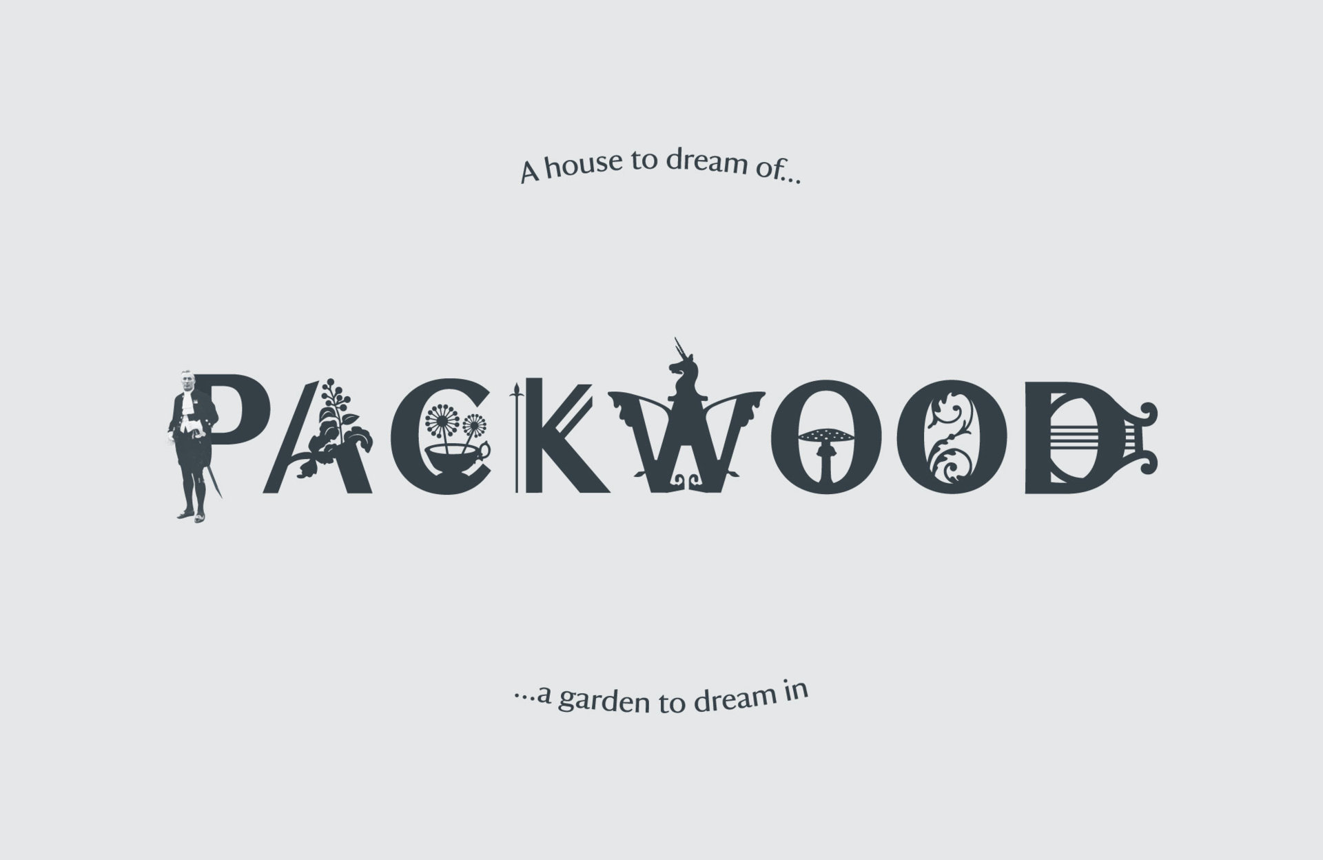
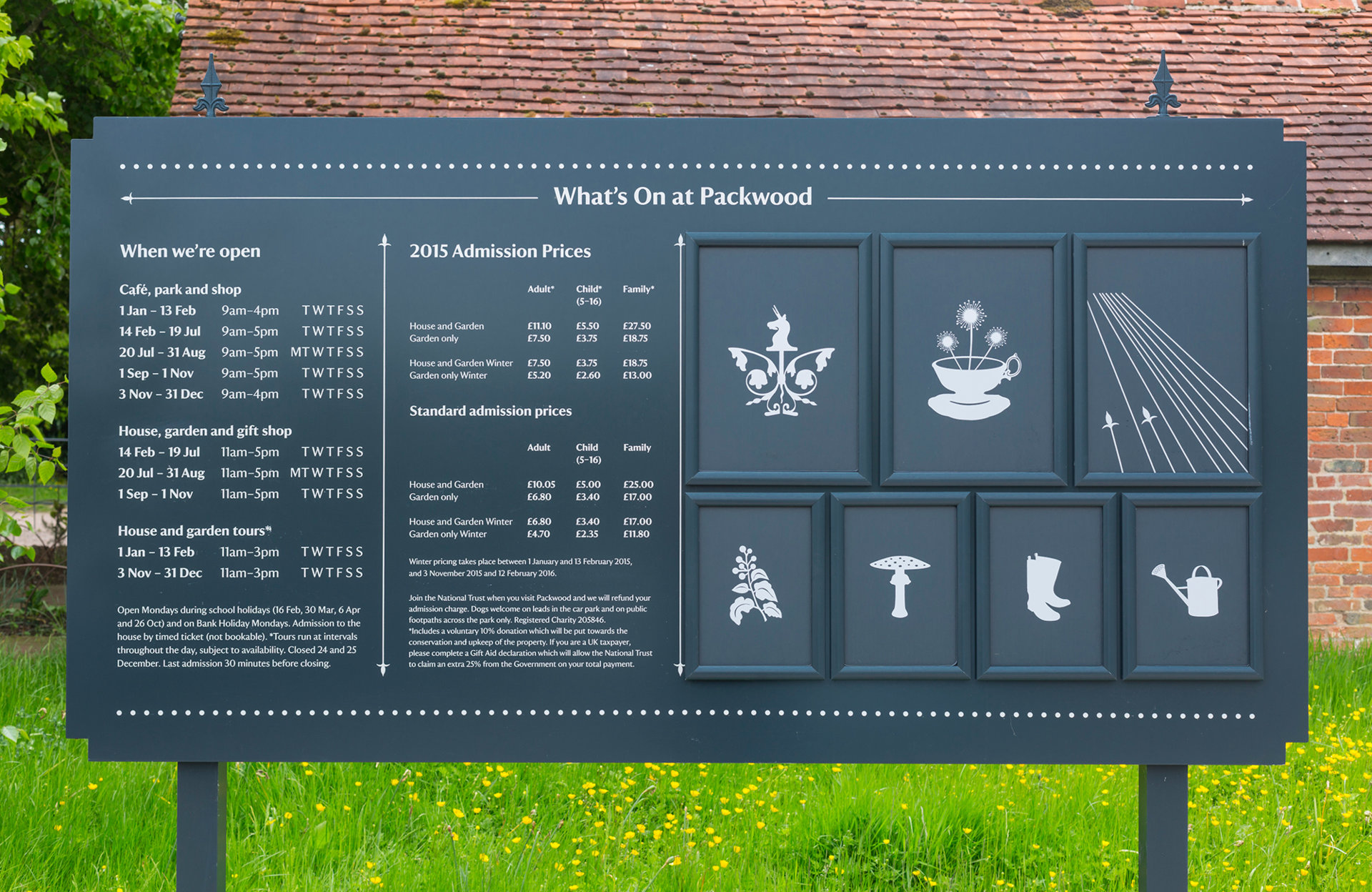
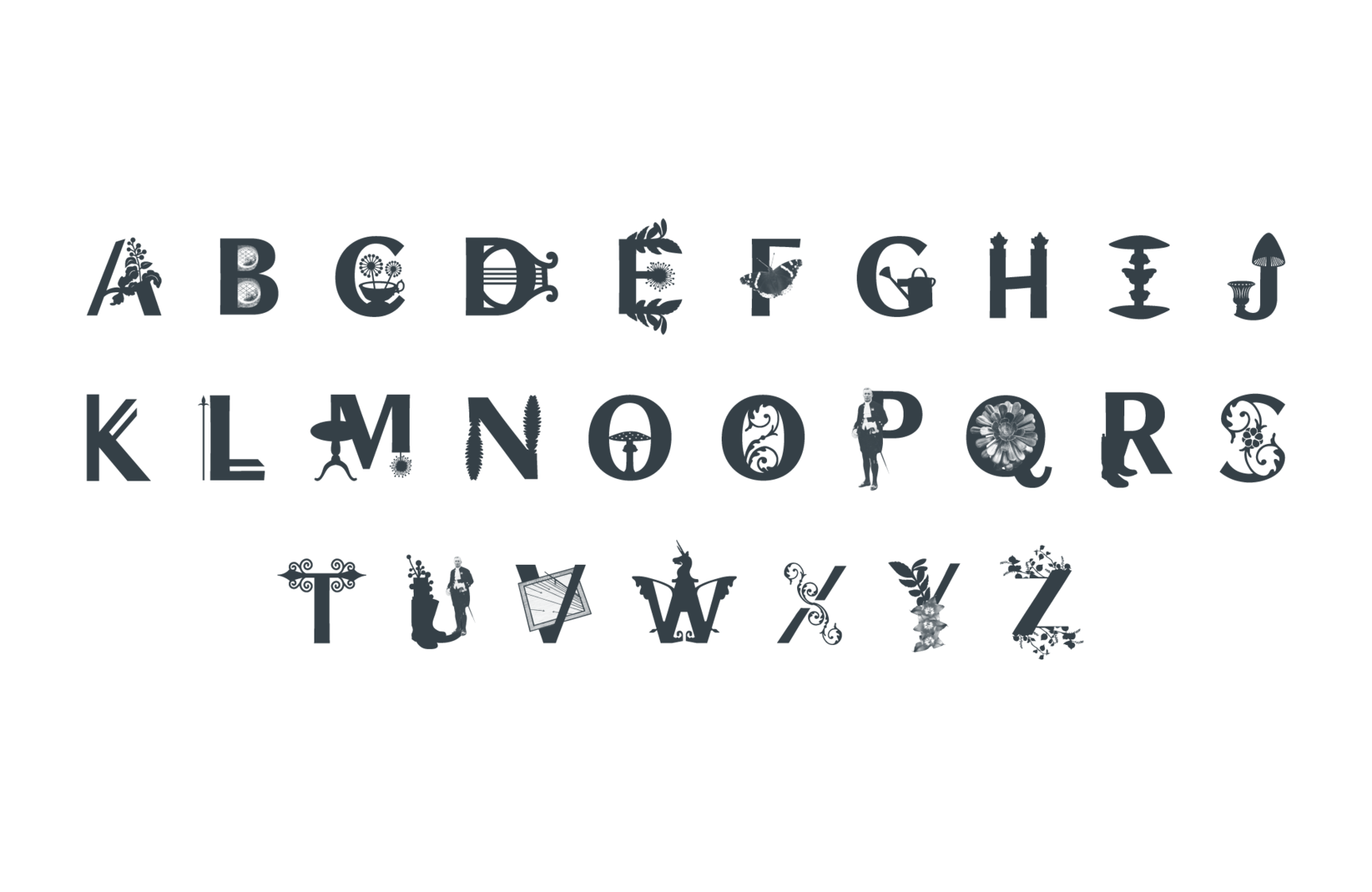
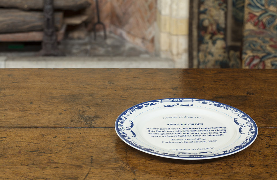
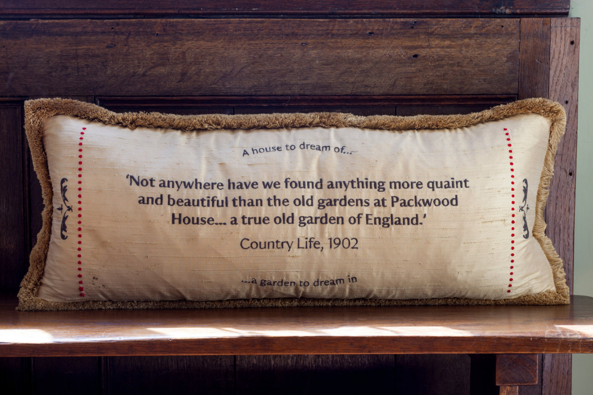
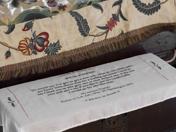
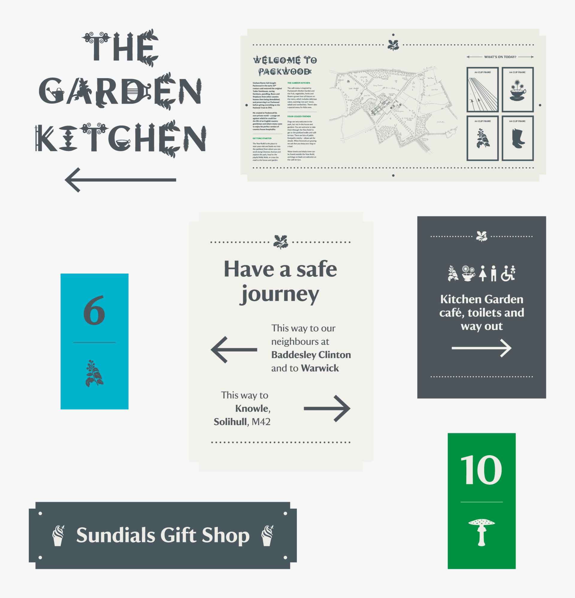
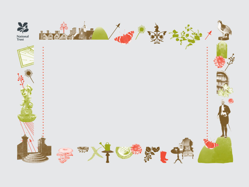
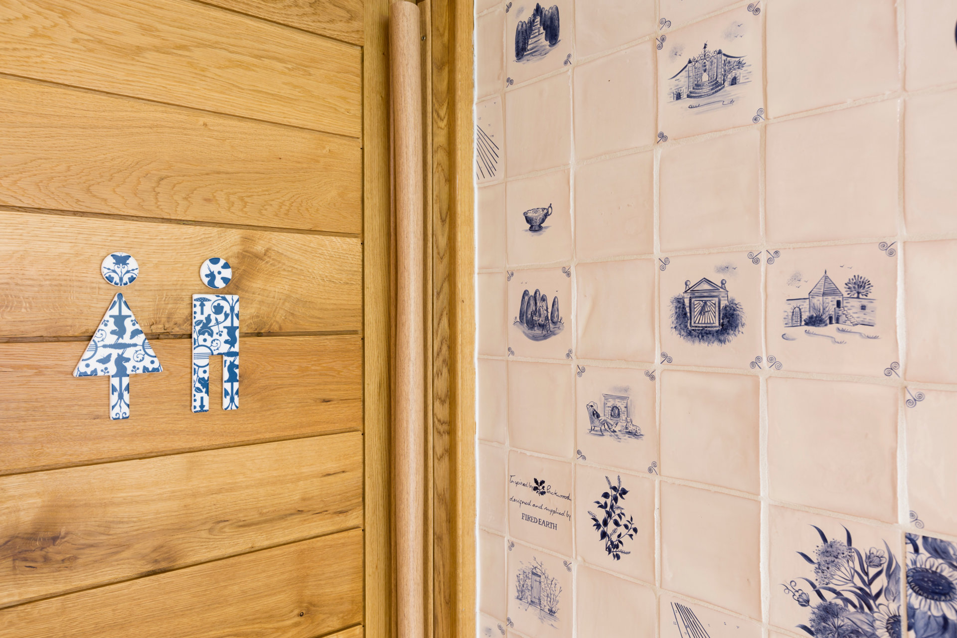
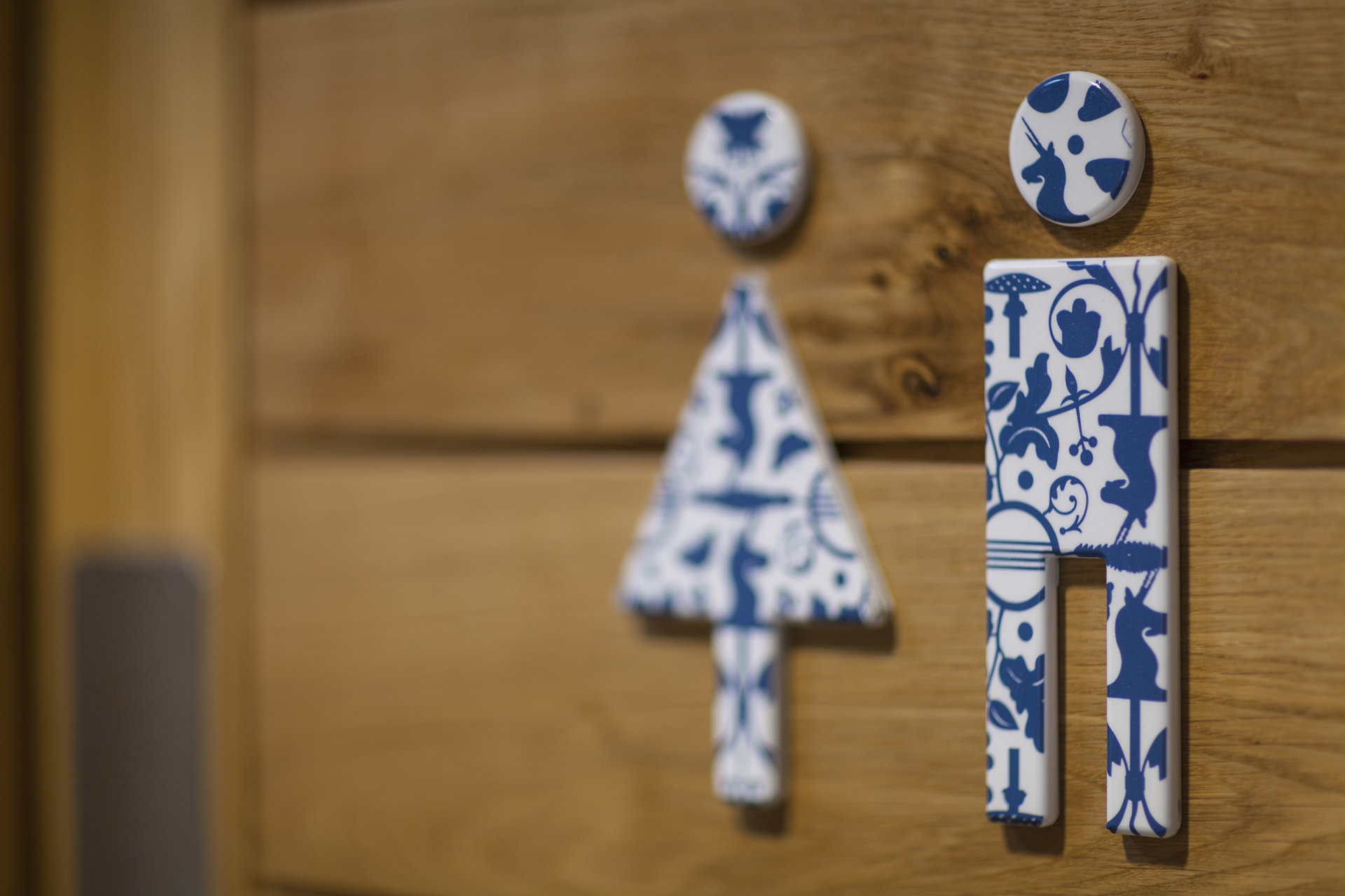
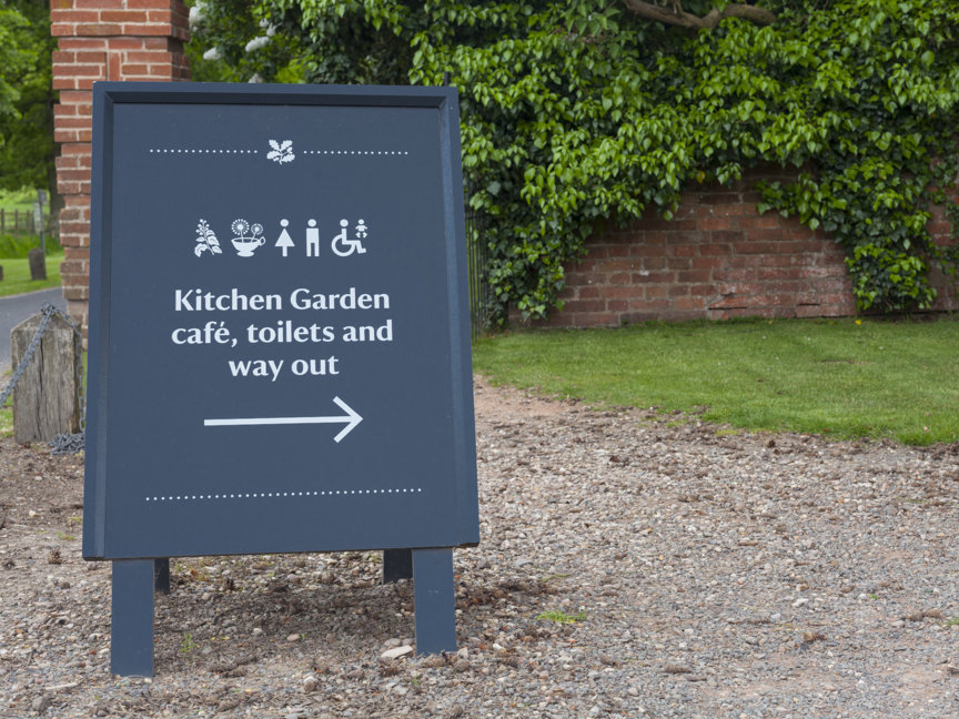
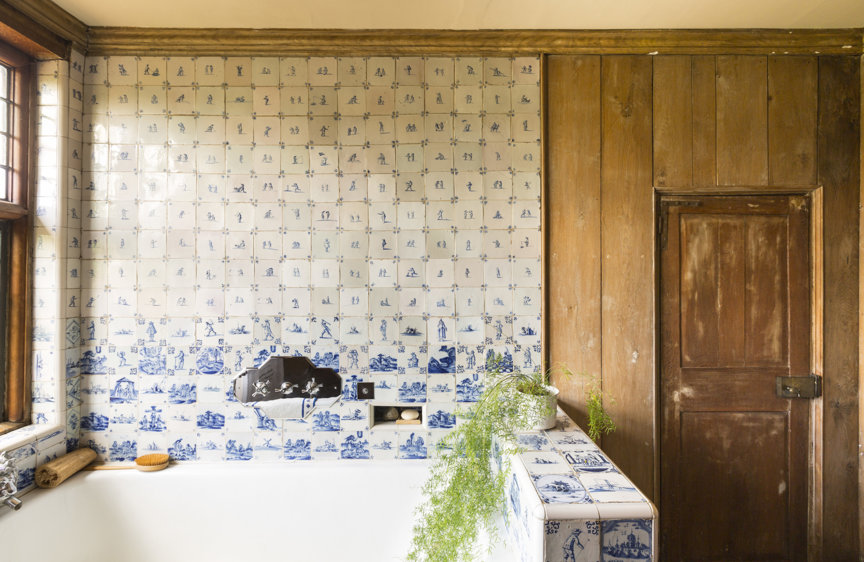
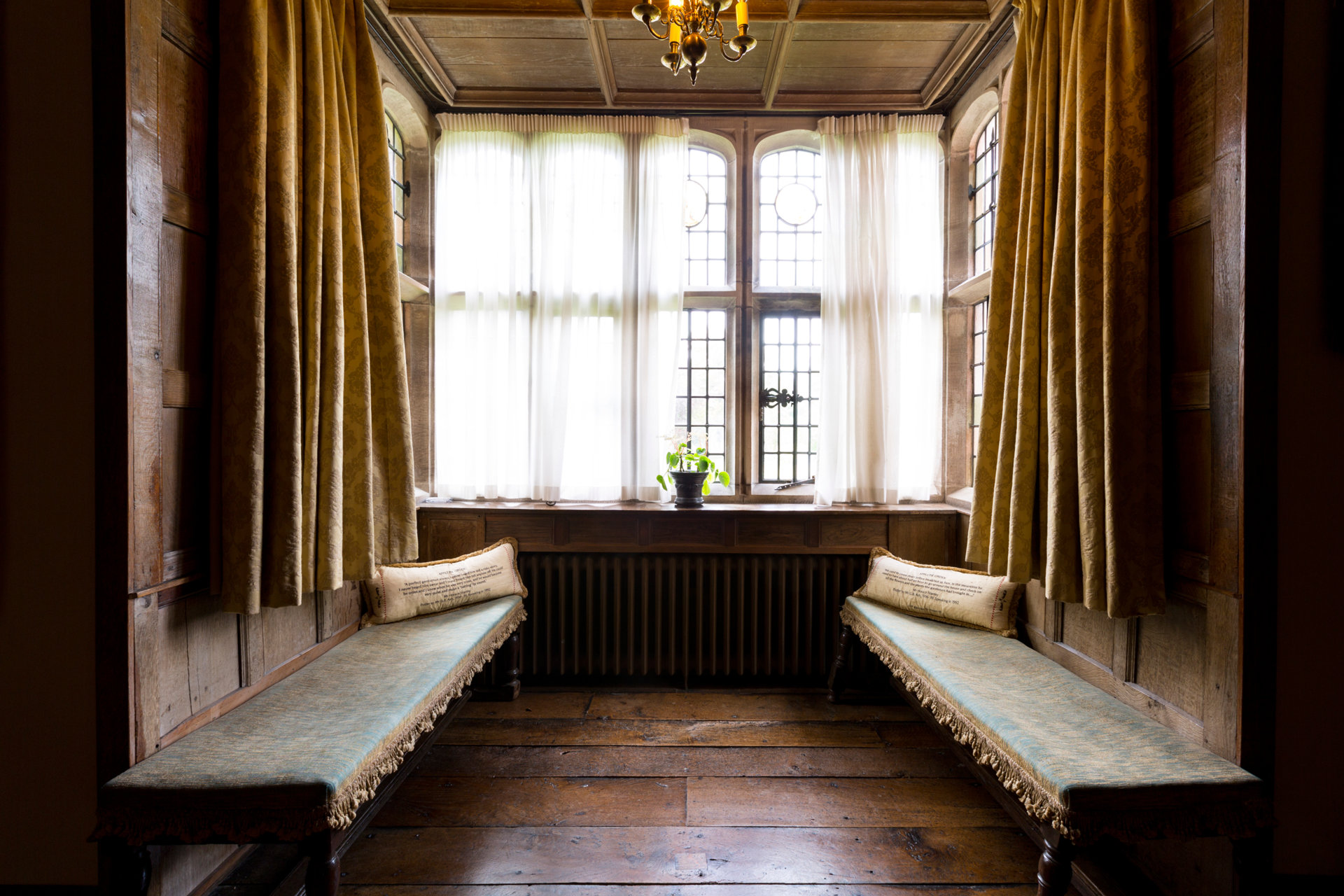
Taking inspiration from details found in and around the property, we created a bespoke typeface and suite of icons that formed the foundations of the identity. Icons, borders and type are utilised throughout the property's signage, wayfinding and interpretation.
The results at Packwood House have been a huge success and are now considered the benchmark for a system that is being rolled out across other National Trust properties.
